
eBay Shuffles Seller Information Around On Listing Pages
eBay is making more changes to the listing design - this time moving where important seller information is displayed on the page.
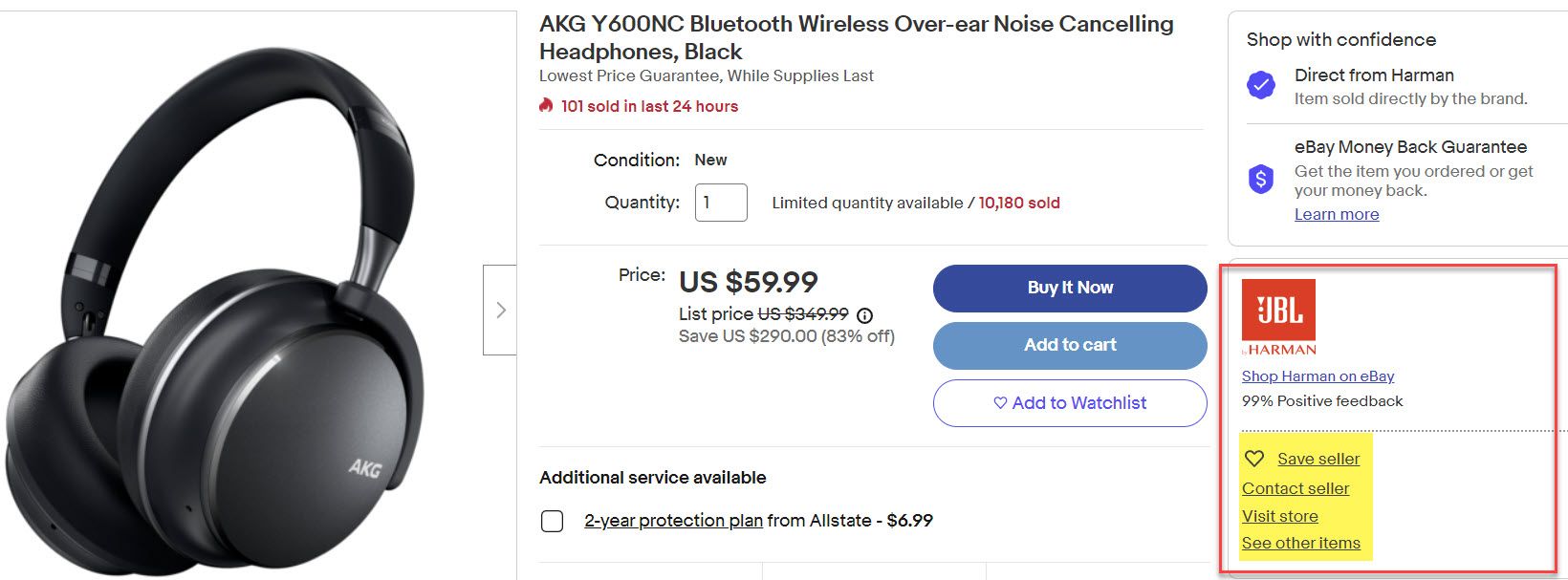
Previously, the seller name and explicit links to save seller, contact seller, visit store, and see other items from this seller were all on the right side of the page.
eBay has now removed the right side section and moved seller info more to middle, just under the title - getting rid of the explicit links to save, contact, visit store or see other items.
If you click the thumbnail store logo image or store name, it will still take you to that seller's store page but that may not be as obvious to buyers as a link that says "visit store" or "see other items".
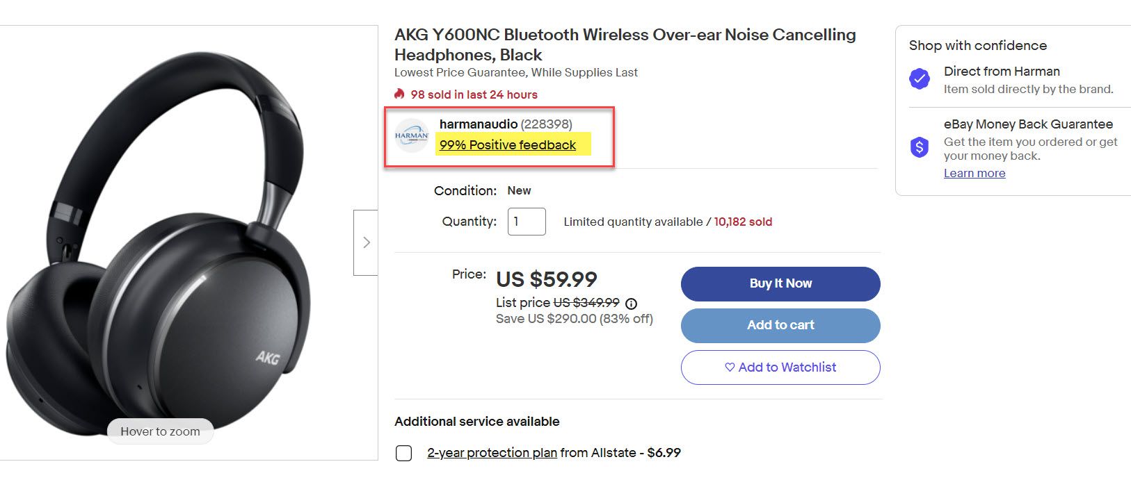
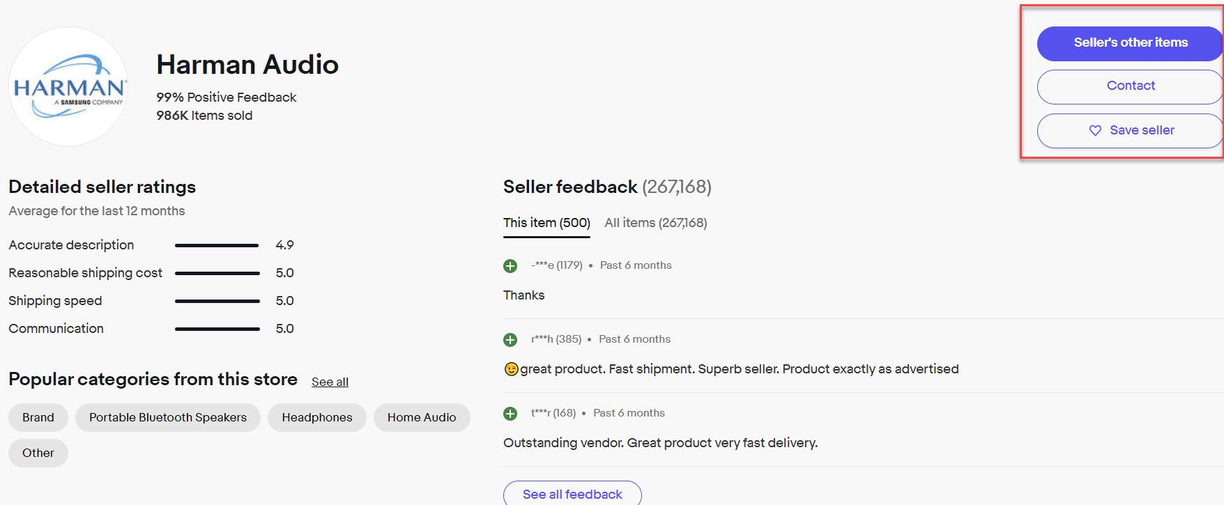
If you click the feedback link, it does not take you directly to the see all feedback page - instead it scrolls about halfway down the listing page where eBay now has a module with feedback for this specific item or alternatively you can select to see feedback for all items
The save seller, contact, and seller's other items have been moved to this module as well.
Some sellers are concerned about what eBay might do with the big empty space they've created on the right side of the page...the obvious answer will likely be to put more Promoted Listings ads in that spot.
eBay is already testing a new kind of ad product that promotes competitor stores with an ad displayed just below that area where the seller information used to be.
 Liz Morton ~ Founder
Sellers are unhappy about the placement, fearing it could cause confusion since buyers might think by clicking on that ad they would be going to the store for the seller whose listing they were already on, not a competitor's store.
I believe moving the seller info to the middle will only make that confusion much worse as buyers will be looking to the right to find the seller information where they are used to seeing it and will be much more likely to inadvertently click on ads in that space.
While this new ad type is still in beta testing and eBay has not released any information about it yet, I believe it is very likely a Cost Per Click model - which makes using confusing dark pattern design like this even more unacceptable.
Is eBay just trying to juice their ad rev numbers by intentionally moving things around like this? 🤨
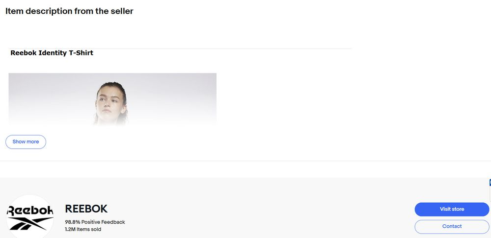
As eBay shuffles the design around to make room for even more Promoted Listings ads, that big feedback module and more, they have to take that space from somewhere and unfortunately that appears to be from what should be the most important part of the page - the item description field.
Liz Morton ~ Founder
eBay has been running various tests that cut off the description field at a certain size with clicking on a "show more" button required in order to view the full description.
You can see in this example where the description ends and the feedback module begins.
While this is just a test at this juncture, all of these changes together don't bode well for what eBay's priorities appear to be when redesigning the listing page.
Sellers are rightfully very concerned all of these changes may lead to more item not as described claims - especially if descriptions are hidden behind show more buttons or other important seller provided information is not noticed because it has been moved to make room for more ads or other design elements.
Not only would an increase in INR claims hurt the seller on those specific transactions, forcing them to accept returns and pay for return shipping, but if a seller has too many claims, it will negatively impact their Service Metrics which may cause them to be charged an extra 5% penalty fee on top of the commission and ads fees they are already paying.

If your rate of 'Item not as described' return requests is evaluated in your service metrics as Very High in the evaluation on the 20th of the month in one or more categories, you will be charged an additional 5% on the final value fees for sales in those categories in the following calendar month.
In my opinion, these changes show a reckless disregard for sellers at a time when eBay can ill afford to alienate their seller base any further than they already have. 👎
What do you think of eBay moving the seller information on the listing page? Let us know in the comments below!


