
How Do eBay Ads Affect User Experience?
It looks like eBay is finally admitting what many sellers have known for a long time - paying for ads has essentially become a required part of the basic listing and selling process on the platform.
It’s simple to start selling on eBay. From creating your account to listing your first product, our latest blog will teach you how to become an eBay seller. https://t.co/bGVflnkiqn#eBay #selling #eBayAds #eCommerce #retail #marketing
— eBay Ads US (@eBayAds) January 12, 2022
Previously, I looked at how the increased pressure on sellers to use paid advertising affects the search experience and how the listing page is used to direct potential buyers to competitor listings.
 Liz Morton
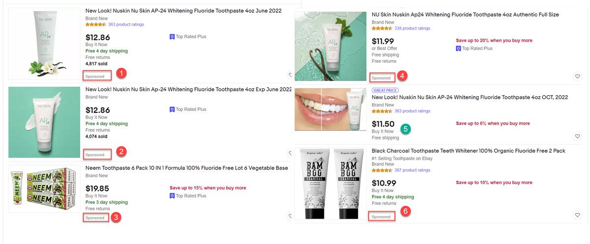
But that's only part of the story. Even if the potential buyer stays on your listing and ends up making a purchase, ads stuffed on the listing page may be creating a negative user experience.
Shoehorning #eBayads into every pixel is an awful consumer experience$EBAY's #PromotedListings #ads also bury CRITICAL seller item descriptions🤨
— FidoMaster🐕 (@unsuckEBAY) December 29, 2021
This makes it less likely buyers will ever see these details
<1/3rd of this seller-paid vertical space is actual listing content😲 pic.twitter.com/O9gewrT8eu
Laying out a listing page like FidoMaster did here provides a striking visual - you can't help but notice not just the the total amount of ad space, but how much it dominates the page. Important seller provided information like item description easily gets lost amongst all that ad space.
A seller in the community pointed out the problem is even worse in the mobile app experience.

The mobile app has tons of sponsored ads between the item title and the item description. I've gotten feedback from numerous buyers that they didn't know there was an item description because they thought the ads- typically seen at the bottom of a page- were the bottom of the page. My wishlist item is for the item specifics and description to appear above sponsored ads on the app's small screen.
I agree, the junky adverts on the app need to go - all that clutter is making for a very poor buyer experience - A POOR BUYER EXPERIENCE, EBAY, and aren't we all about buyer experience here?
When buyers ask me questions about things that are spelled out in the IS and the description, I've gotten into the habit of answering their question then letting them know that on the app they have to scroll down past the rows of other listings to find the description info.
On a phone screen all the listings really do look like the end of the listing- and if I didn't know to scroll past them to find the description- I'd probably be asking sellers those kinds of questions, too.
I'm looking at a listing now and in order to find the description I have to scroll past multiple rows of "more like this" and "buyers also looked at" and "top rated seller" listing placements.
On the website it's pretty clear- most of the time- that the description is just below those rows of other listings. On the app with small phone screens, it's really not.
This is one of my biggest frustrations as a buyer and seller. I do not use the app for just this reason, having to scroll past all the ads just to find the description. It needs to be above the ads, but since eBay makes a lot of revenue from those sponsored ads I doubt they will change it. While it is easier to find the description on a desktop it is still a cluttered mess and would be a big improvement to move the ads down.
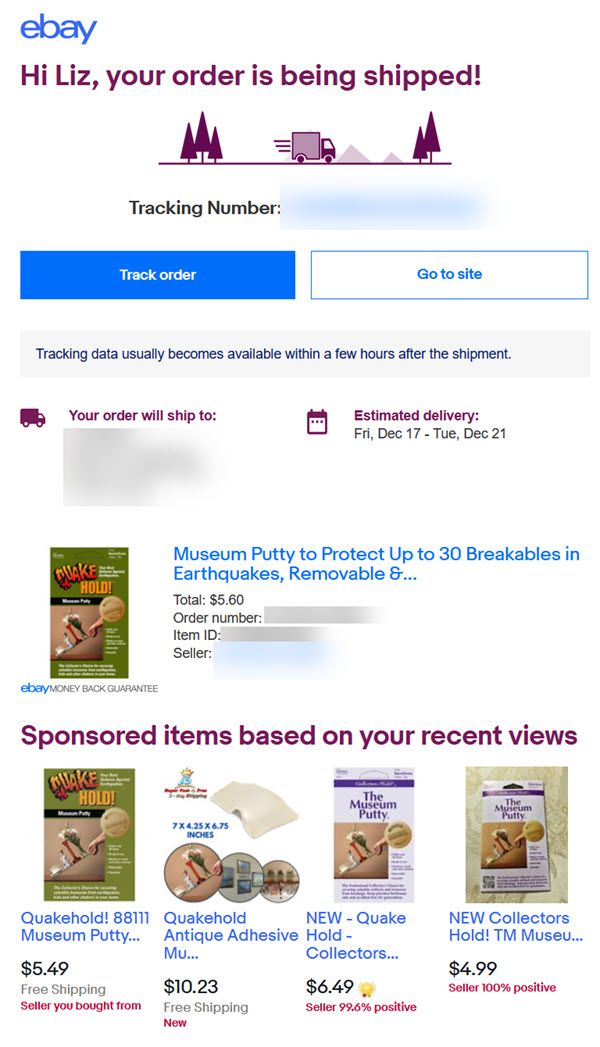
Another example of eBay's overzealous ad stuffing causing a terrible user experience is their insistence on using order status emails to serve more ads to buyers - often ads for the same exact item they already purchased.
I was curious if eBay has done any kind of user experience A/B testing to see what effect it would have on Not As Described claims and returns if eBay were to more prominently display seller provided information like the description instead of burying it amongst all these ads, so I asked about it one of the weekly community chats.
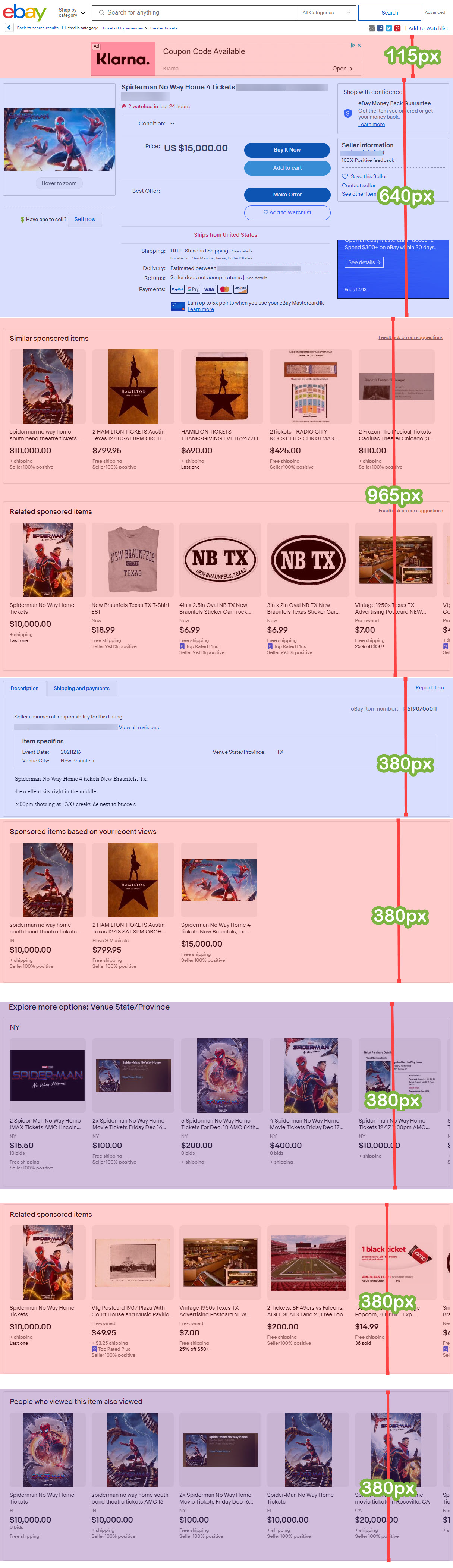
tyler@ebay I was chatting with a friend who put together this really interesting visual showing how the listing page displays with paid advertising vs seller provided info.
I was struck by how far down the page the description gets pushed in this example - just curious, has eBay done any kind of A/B UX testing to see what effect it would have on Not As Described claims if the description was more prominent and not hidden between all these ad spots?
Tyler responded
Hi @valueaddedresource - I don't have insight into the in-depth tests that are being run from a UX perspective, but I will share this with the Promoted Listing team and let you know their response as I receive it.
Unfortunately, there have been no further updates with a response from the Promoted Listings team at this time.
What are your thoughts on the user experience of how ads appear on listing pages as either a buyer or seller? Would changing how descriptions are displayed cut down on returns and not as described claims?
Let us know in the comments below!


