
eBay Moves Ads, Item Specifics & Description Placement In Item Page Design Test
eBay appears to be testing rearranging the order of how ad modules, seller-provided descriptions and item specifics are displayed to buyers on item pages.
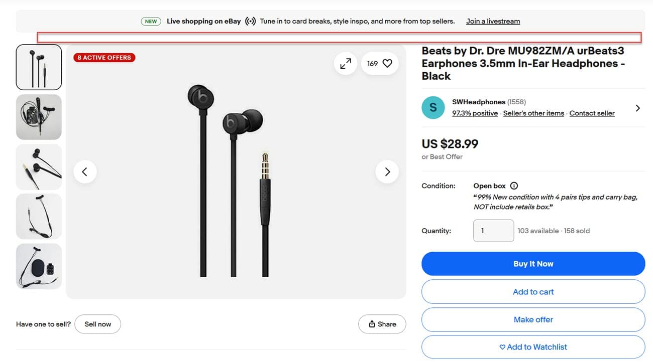
The standard View Item Page experience typically displays an eBay Live banner and/or Promoted Stores banner at the top, then a row of ads before the images, seller information panel, and Buy It Now, Add To Cart, Make Offer or Add to Watchlist Buttons.
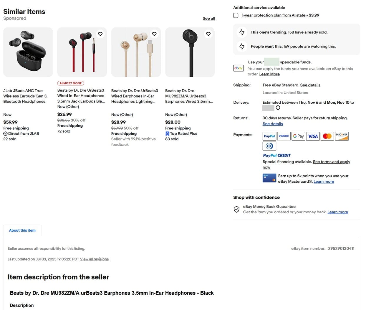
Then as the buyer continues to scroll down the page, the buyer will see:
- 2 rows of ads
- Item Specifics
- Item Description
- About the Seller/Seller Feedback
- A Promoted Stores ad
- Product Ratings and Reviews
- A continuous wall of ad modules until the end of the page
Standard eBay Item Page Display
But some buyers report they are now seeing the order of information on the View Item Page has changed, moving the description up while still leaving plenty of room for ads.
In the test version, there may still be a banner for eBay Live or Promoted Stores at the top, but I am not seeing the row of ads that is usually above the images and title.
Continuing down the page, there is now only 1 row of ads before it shows the seller-provided description.
The second row of ads that was previously above the description has now been moved below it, with the Item Specifics now appearing below that row of ads.
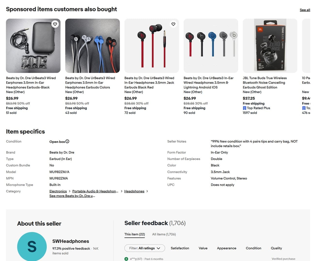
After the item specifics, it shows About This Seller/Seller Feedback and then the rest of the page is the same as the previous version.
eBay View Item Page Test
eBay began undertaking an overhaul and redesign of the View Item Page in 2023, with seller initially ecstatic when the company said they were going to "bring critical information like Item specifics and seller description higher up on the page before any modules that show other items and ads."
But when the final version of phase 1 of the redesign rolled out, eBay disappointingly reneged on that promise and continued to show competitor ads above seller-provided descriptions and item specifics.
In one mock up of potential future changes, eBay showed that they might bring the description higher up and into the right column as a shortened description, with the buyer having to click the summary to see more, similar to the mobile app experience.
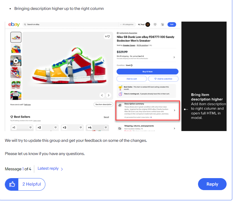
To my knowledge, eBay has not actually tested this type of design for the desktop web View Item Page yet - but interestingly the mockup shows the summary may be provided by eBay AI, which is something eBay has been testing in other ways on the site.

This new test view buyers report seeing today makes it so there is only 1 instead of 2 rows of ads above the description, which many sellers may say is an improvement - but doing so at the expense of moving Item Specifics further down the page may not provide the best buying experience either.
But what's likely to really frustrate sellers about this test is that once again, eBay is changing things around with no notice or announcements during the crucial Q4 holiday shopping season when negative or even just different than expected buying experiences can be particularly harmful to sales.
As one seller put in an eBay community forum post about the changes:
"I guess a test...hopefully, but bad time and hurts continuity of information to say the least."
What do you think of these latest eBay View Item Page test? Let us know in the comments below!


